
Launching a Burger Brand
that is pure guilty pleasure.
There’s something undeniably satisfying about biting into a juicy, flavorful burger – the savory taste, the mouthwatering aroma, the satisfying texture. For many of us, burgers are more than just a meal – they’re a beloved culinary icon that has become an integral part of our culture. From fast-food chains to gourmet restaurants, this classic dish has no shortage of options. But despite our love for burgers, we still feel guilty when we indulge. The high calorie, fat, and sodium content can leave us feeling bloated and regretful. This was our leading insight when we built this delectable brand of burgers. A burger is almost like a forbidden love- something that comes with hesitation and constricted feelings.

CONSUMER RESEARCH
BRAND STRATEGY: POSITIONING & ARCHITECTURE
IDENTITY & PACKAGING DESIGN
COMMUNICATION DESIGN: DIGITAL & E-COMMERCE
THE INSIGHT
Consumers experience a tug-of-war between desire and restraint when choosing indulgent foods, craving the pleasure of a juicy burger while wrestling with feelings of guilt and dietary concerns.
THE STRATEGY
Our strategy embraces this duality by positioning the burger as a guilt-free indulgence, transforming the act of eating a burger into a bold, unapologetic celebration of flavor and satisfaction.

The logo for B Burger encapsulates the essence of indulgence and the joy of succumbing to one’s cravings. Its vibrant design features a bold "B" encircled by a confident declaration, "It's okay to give in," set against a backdrop of warm, inviting colors. This identity invites consumers to embrace their desires without guilt, celebrating the personal satisfaction and pleasure that comes from enjoying a well-crafted burger. The logo's dynamic and playful energy mirrors the brand's ethos of boldness and authenticity, encouraging everyone to savor the moment.
A Visual Language that was young, playful and brought out the retro-vibe


When branding a burger chain, you need a design that grabs attention and leaves a lasting impression. The communication is bold and vibrant, combining loud colors and eye-catching typography. Our goal was to create a brand that stands out in a sea of fast-food chains, and our approach was to be playful, energetic, and unapologetically fun.
We used a bright color palette to evoke a sense of hunger, excitement, and indulgence. The typography was bold and playful, featuring a mix of sans-serif and handwritten styles that add personality and character to the brand. Together, these elements create a dynamic visual identity that draws attention and makes our burger brand stand out from the crowd.


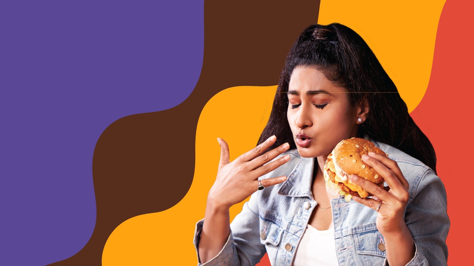
The art direction for the B Burger brand shoot centers on capturing the exuberant joy and unapologetic indulgence of enjoying a burger. Each image is designed to evoke the senses and celebrate the pleasure of the moment, from the vivid, mouth-watering close-ups of the burgers to the genuine, ecstatic expressions of diverse individuals savoring each bite.
The use of dynamic, lively settings and a rich color palette underscores the brand's ethos of guilt-free pleasure, portraying a vibrant and inclusive atmosphere where everyone is invited to indulge in their cravings without hesitation.
