
Crafting Krunchillo: Crafting a
Fun Identity for a Healthy Brand
CONSUMER RESEARCH
BRAND STRATEGY: POSITIONING & ARCHITECTURE
IDENTITY & PACKAGING DESIGN
COMMUNICATION DESIGN & GUIDELINES
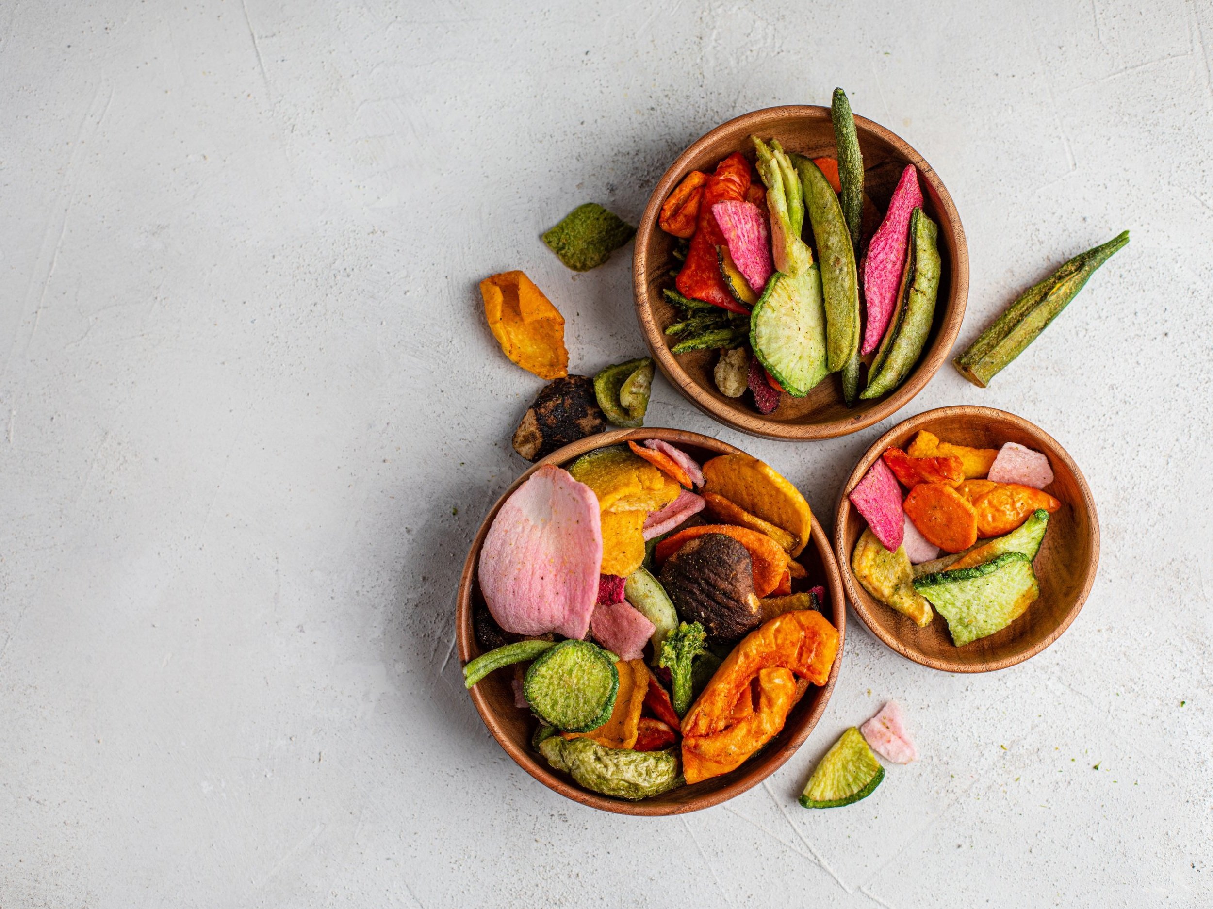
Krunchillo is a healthy, ready-to-eat chips made from fruits and vegetables which uses a vacuum frying technology that cuts oil usage by almost 50% in preparation. It is targeted at mass Indian consumers who want healthy snacks without compromising on the taste.
We worked closely with the team at Krunchillo to create a vibrant and appealing brand identity that mirrors its healthy, fun, and innovative product offering. By focusing on its unique vacuum frying technology and targeting health-conscious Indian consumers, we crafted a brand that seamlessly blends wellness with enjoyment, ensuring Krunchillo stands out in the competitive snack market.
The Krunchillo identity design reflects the perfect balance between a satisfying crunch and a laid-back, fun vibe, symbolizing how
the snack delivers both excitement and relaxation in every bite.
The Consumer Insight
Across all stages of life, people crave moments of joy and connection, seeking happiness in the everyday. Snacking is one of life’s simplest pleasures, so why should it come with guilt?
The Strategic Solve
THE UNBORING SNACK FOR NON-STOP LIFE
In our busy, non-stop lives, we desire balance—time for work, play, family, and joy. To truly embrace every moment, we need snacks that fuel our energy and keep the fun going. Enter Krunchillo, the guilt-free, vibrant snack that keeps up with your non-stop lifestyle. Experience bold flavors and endless enjoyment for those who live life with zest.

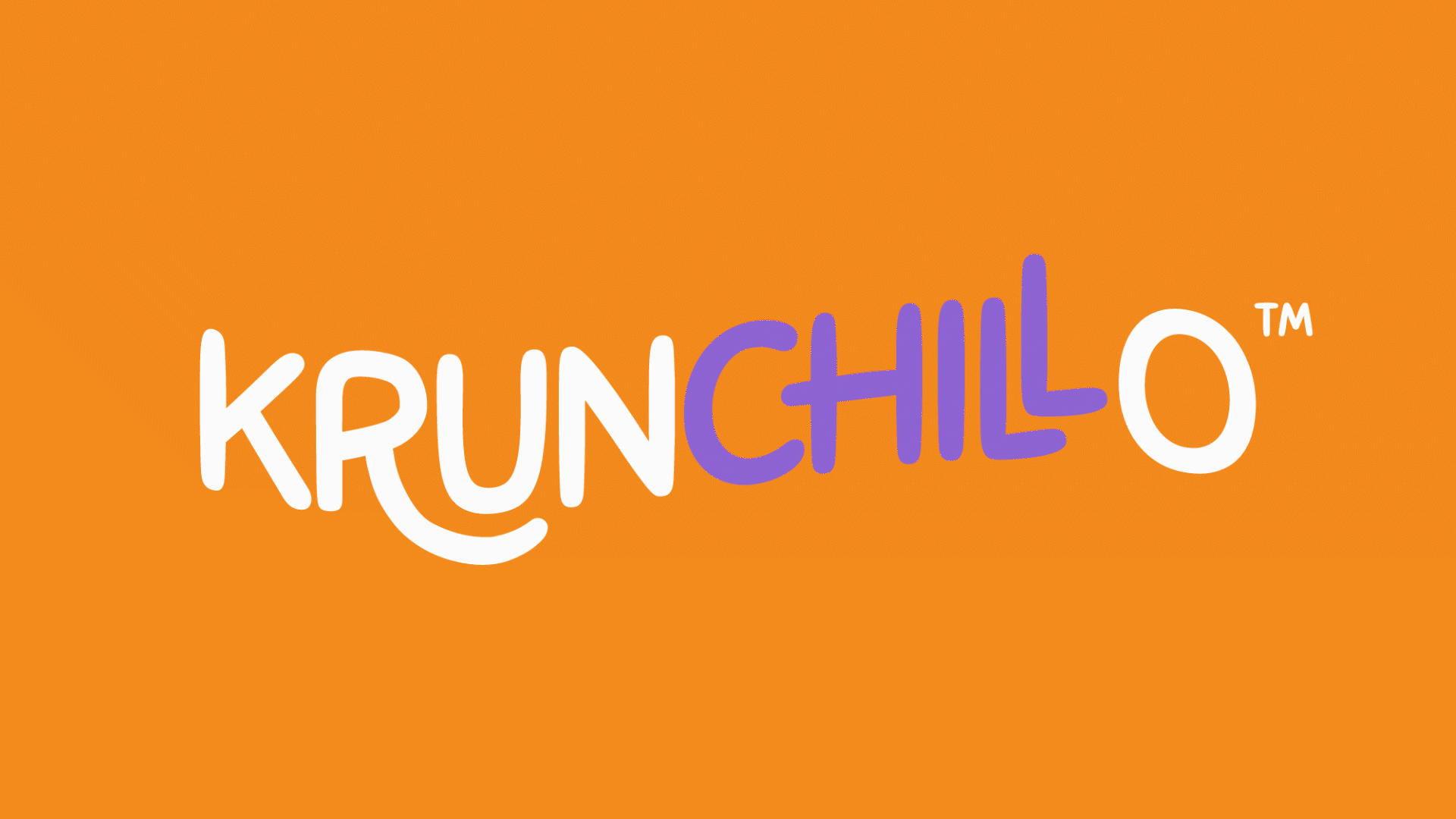
The Krunchillo logo design was carefully crafted to reflect the brand’s playful and relaxed identity. The stroke of the letter "R" was softened to evoke a laid-back, chill feeling, while the letter "L" was raised to add a quirky, fun vibe. Lastly, the letter "O" was tilted slightly, giving the design an extra dynamic touch that emphasizes the brand's lively and vibrant personality. Each modification contributes to an engaging and distinctive visual identity that perfectly captures Krunchillo's essence.
This illustration captures the essence of playfulness and simplicity, with stick figures in various joyful poses representing spontaneity and fun. The minimalistic design emphasizes the carefree spirit, making it a perfect visual representation of a brand that celebrates lightheartedness and creativity in everyday life. Each figure reflects a sense of movement and happiness, aligning with the lively and dynamic identity of Krunchillo.
The Character Design


The Visual Mood
Packaging Design
The packaging design for Krunchillo was carefully crafted to highlight the product while creating an inviting allure for the chips. At the forefront is the vibrant product image and the playful character interaction, which immediately captures attention and emphasizes the snack’s fun, lighthearted appeal. The bold logo and flavor description ensure instant recognition, while the claim of "50% less oil" is subtly positioned as a delightful surprise element, adding a layer of intrigue for health-conscious consumers. This thoughtful packaging architecture balances attraction and information, making the product both visually appealing and informative at first glance.


