When Rubicon Consumer Healthcare set out to build a vitamins brand, the opportunity was far bigger than selling supplements—it was about rewiring how India thinks about health itself. In homes across the country, the green medicine box has always been the first line of defense—filled with pills for colds, fevers, and muscle pulls. A symbol of reactive, curative care rather than a way of life.
Fab Vitamins had to change that. It had to challenge deep-rooted beliefs and nudge people towards a proactive, everyday wellness mindset. The pandemic had already cracked open that door—wellness was no longer a luxury but a necessity. The moment was ripe to create a shift where vitamins weren’t treated like medicine but embraced as daily allies for living well.
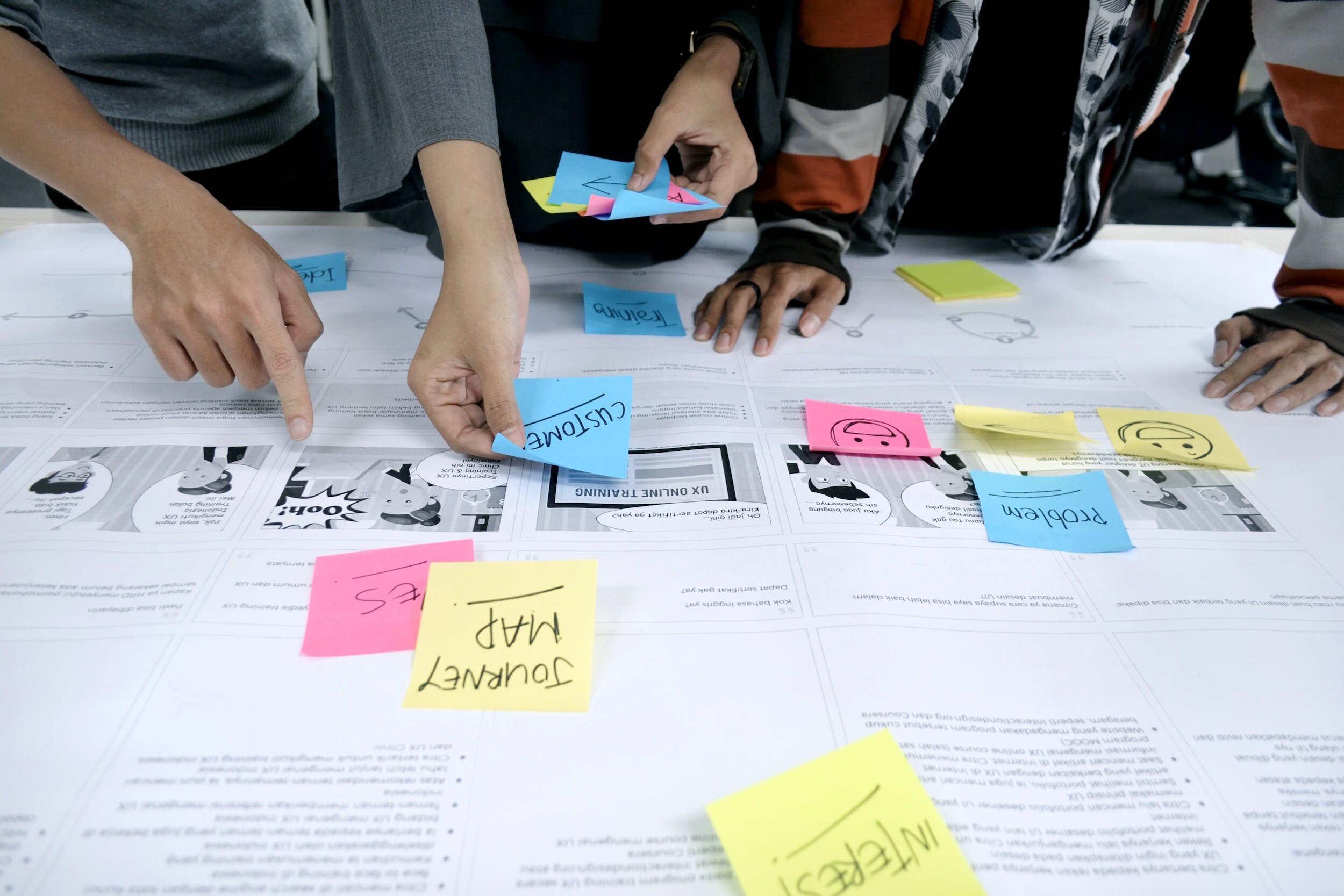
We started by immersing ourselves in the rhythms of Indian households—listening to the habits, anxieties, and small health hacks that defined people’s days. We met consumers like Sonia—a 38-year-old balancing motherhood, piano lessons, street food indulgences, and green juice shots. Someone who cared about well-being but struggled with consistency—turning to home remedies or a bottle of Vitamin C only during health scares.
What emerged was a simple but powerful truth—vitamins were still seen as medicine, a backup, not a daily essential. Yet, beneath the surface was an unspoken self-awareness—a knowledge that health was being neglected, and immunity was fragile. It was in these moments of hesitation and guilt that Fab Vitamins could intervene—triggering a new habit.
Our strategy was clear: Fab couldn’t just sell pills; it had to become a partner in joyful, fearless living. A brand that didn’t preach immunity but promised to help people stay energized, vibrant, and unbound—through life’s chaos, pleasures, and changes.
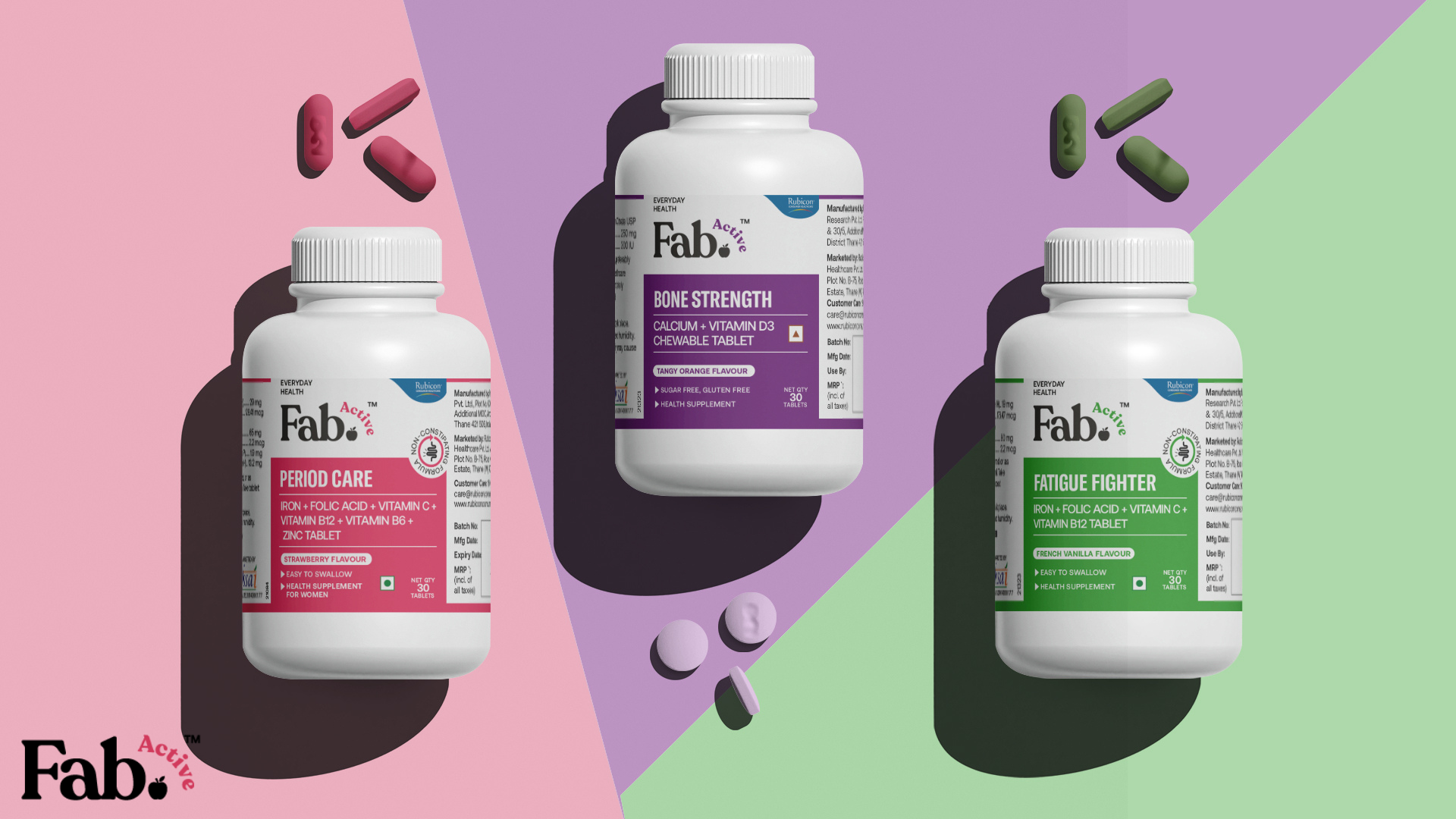
We designed an intuitive, empowering architecture—spanning Fab Immunity, Fab Active, and Fab Junior—to speak to everyone from busy millennials to young kids. The identity balanced strength with softness—a clean, modern wordmark, playful color pops, and symbols like the drop of purity and the seal of goodness.
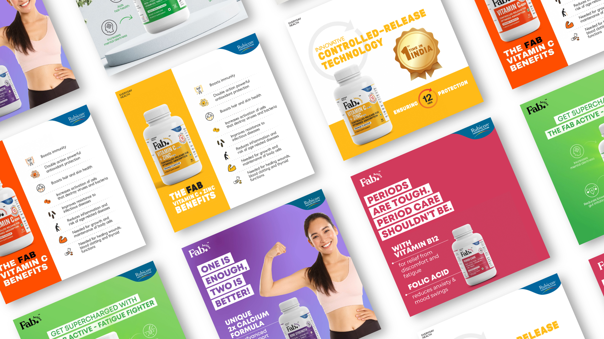
Packaging was vibrant, fresh, and far removed from medicinal cues. From ‘Fatigue Fighter’ to ‘Bone Strength’, every variant told a clear, relatable story. Complex science was distilled into one promise—“Advanced science in a bottle”—smart, approachable, and easy to trust.
Our communication sparked a new conversation—about staying energized, not just protected. By decoding benefits into snackable formats and spotlighting innovations like 12-hour controlled-release technology, the campaign brought vitamins closer to everyday life. Less about what you fear, more about what you love.
The result? A brand that didn’t just sell supplements but seeded a new culture of daily, proactive wellness—shifting vitamins from the forgotten green box to the kitchen counter. A habit, not a chore. A choice, not a cure.