Building a Revolutionary Fashion Brand for The Gen-Z Consumer
CONSUMER RESEARCH
BRAND STRATEGY: POSITIONING & ARCHITECTURE
IDENTITY & PACKAGING DESIGN
COMMUNICATION DESIGN & GUIDELINES
Building a Revolutionary Fashion Brand for The Gen-Z Consumer
Virgio is an international global tech-led fashion brand catering to the digitally native generation. Virgio's platform is built on a social commerce-led model that disrupts how this generation discovers and buys fashion. The brand aims to always be in context, always now, and relevant to its customers. It is a community-led, all-inclusive, gender-neutral brand that delivers impact to the brand's co-creators; the designers, influencers, artisans, manufacturers, sewing operators, and more.

The Consumer Insight
Through consumer research, we identified that this generation thrives on change. Chasing trends and re-inventing oneself is the norm. While wanting to fit in, there is a subtle need also to stand out. Small expressions of rebellion become a part of their personality. This is what inspired Virgio’s identity
The Identity
The identity is representative of the Gen Z mindset and behaviour. While this generation wants to self-express,
they do not wish to be outliers. So they take from each other to fit in while standing out. Their wardrobes might have the same basic white t-shirt, but their style makes it unique. One might wear it with an oversized denim jacket, another with a front knot.
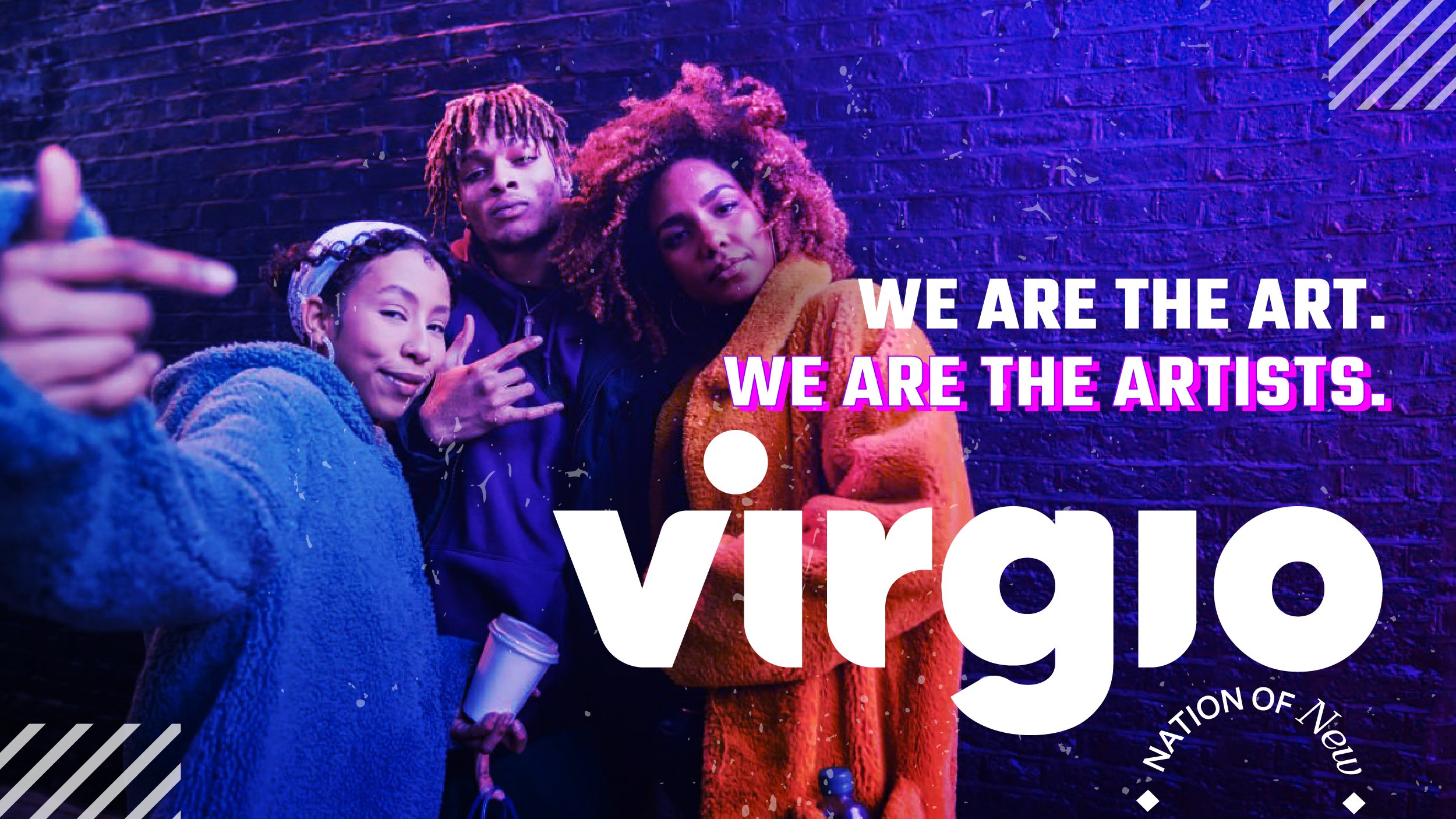
Inspired from here, the identity is clean, and the typography is simple yet has a twist to it. The ‘V’ in virgio stands for ‘we,’ the community. The ‘I’ stands for individuality. The dot on ‘I’ has been placed between the V and I for a reason- it’s what sets them apart. It’s self-expression.
The Visual Mood:
BUILDING THE VIRGIO BRAND
The VIRGIO Brand Strategy
-
Through consumer research, we identified that this generation thrives on change. Chasing trends and re-inventing oneself is the norm. While wanting to fit in, there is a subtle need also to stand out. Small expressions of rebellion become a part of their personality. This is what inspired Virgio’s identity.
-
Express & Evolve
Rather than positioning itself as a passive label that dictates what’s in and out, we wanted to present the brand as a living, breathing community that is all-inclusive.
The brand supports fashion democracy. It does not dictate, but co-creates. It does not preach, it provides.
• Fashion forward
• Inclusive
• Technology supported
• Continuously adapting -
'The Magician.' This archetype symbolizes transformation, innovation, and the ability to turn dreams into reality through vision and creativity. Virgio embodies transformative power, seamlessly blending community, creativity, and commerce to reimagine fashion as always-now and always-inclusive. It inspires a world where style discovery feels magical, empowering co-creators and consumers alike to shape trends in real-time.
-
The tone of voice is progressive, luring, contrasting and expresses movement but it does not come off as flashy and preachy.
Therefore the identity needed to be fresh, modern, and edgy. With its strong recognisability and contemporary feel, a sans-serif “V” was a great choice. The identity conveys simplicity and sophistication with a bit of oomph with the dancing ‘dot’ that rests between the V and the I.
We did this across channels, including social media, print, and event advertising. The brand showcases its commitment to inclusivity and diversity through engaging content that features a diverse range of models, a bold style, and distinct typography.


