Creating a Collection of Women's Health
Brands under the Prega News Umbrella
CONSUMER RESEARCH
BRAND STRATEGY: POSITIONING & ARCHITECTURE
IDENTITY & PACKAGING DESIGN
COMMUNICATION DESIGN & GUIDELINES
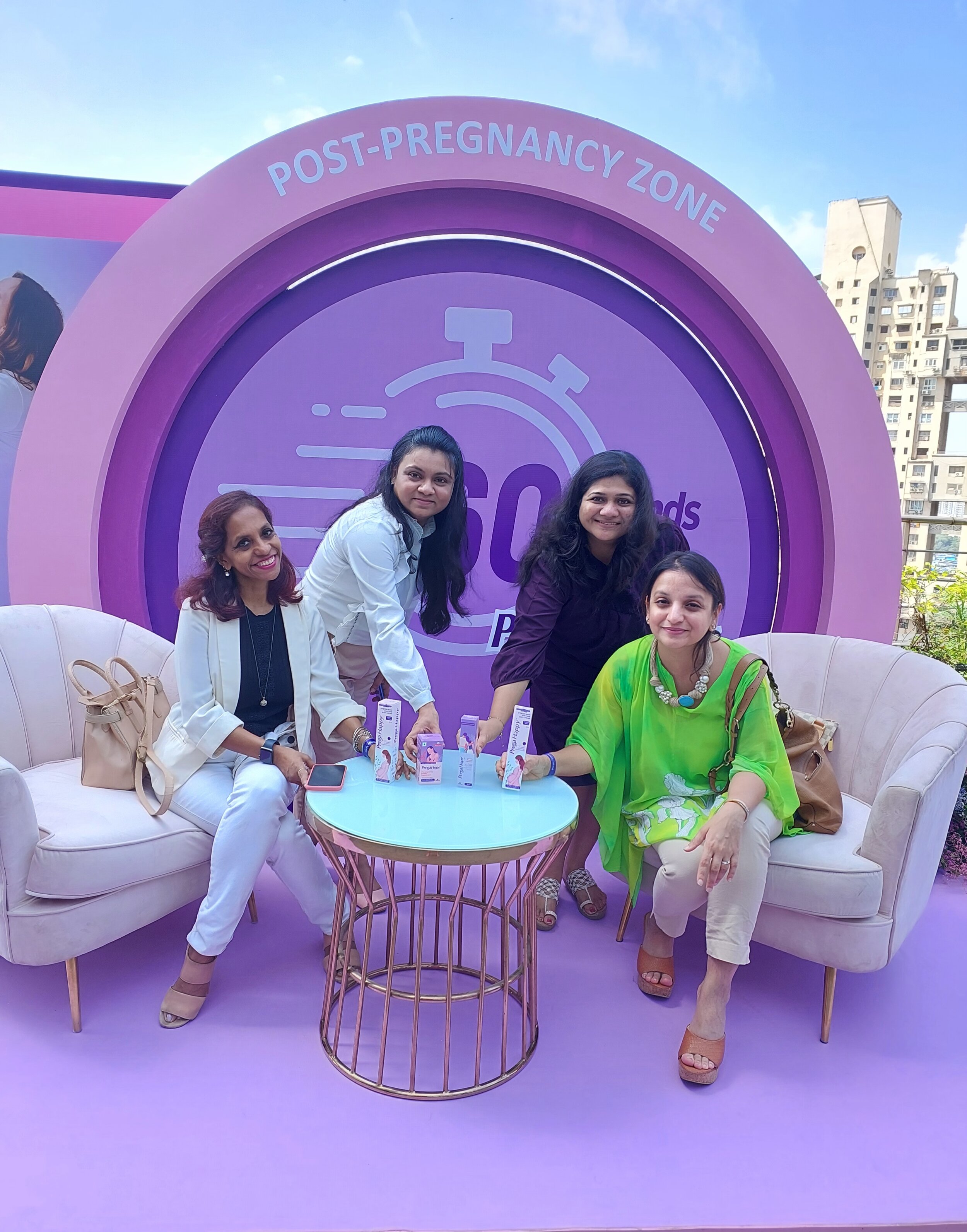
Mankind Pharma's PregaNews revolutionized the Indian market with home pregnancy checking kits in 2007. Over time, PregaNews gained the top spot. Now, aiming to launch three new women's health categories (Pre-Conception Supplements, Stretch Marks and Itching Lotions, and Fertility Lubricants), we helped build these brands from scratch. Starting with consumer research to comprehend women's needs in the pre and post-conception stages, we helped craft the brand’s positioning and developed a clear brand architecture and design language for the portfolio, laying the foundation for the future success of the entire portfolio.
We talked to women online, some planning to have a baby and others in their early stages of pregnancy. We learned about what they needed, what worried them, and where they struggled during this time. Pregnancy and the time after having a baby are special, but they can also be emotionally tough. We realized that women need help and someone to lean on during this journey.
While the journey of pregnancy and postpartum is a beautiful phase in a woman's life, it often comes with significant emotional challenges. These women expressed the need for emotional support and guidance at different stages of this journey. This insight drove us to develop two extension brands: PregaHope, dedicated to the pre-conception phase, and PregaHappy, tailored for the postpartum period. These brands aim to provide the emotional anchoring and support that women seek during these crucial life moments.
The Consumer Insight
Creating Brand Extensions to the existing PregaNews brand
Our brand strategy involved integrating PregaHope and PregaHappy seamlessly within the Prega News portfolio, maintaining the strong Prega prefix while introducing distinct suffixes to represent the two different phases. By leveraging this architecture, we have created a cohesive and recognizable brand family that resonates with our target audience. PregaHope, with its unique suffix, represents the pre-conception phase, while PregaHappy, denoted by its own distinctive suffix, caters to the postpartum period. This approach not only capitalizes on the equity of the trusted Prega News brand but also ensures clarity and relevance for our customers at every stage of their pregnancy journey.
BUILDING THE PREGAHOPE BRAND

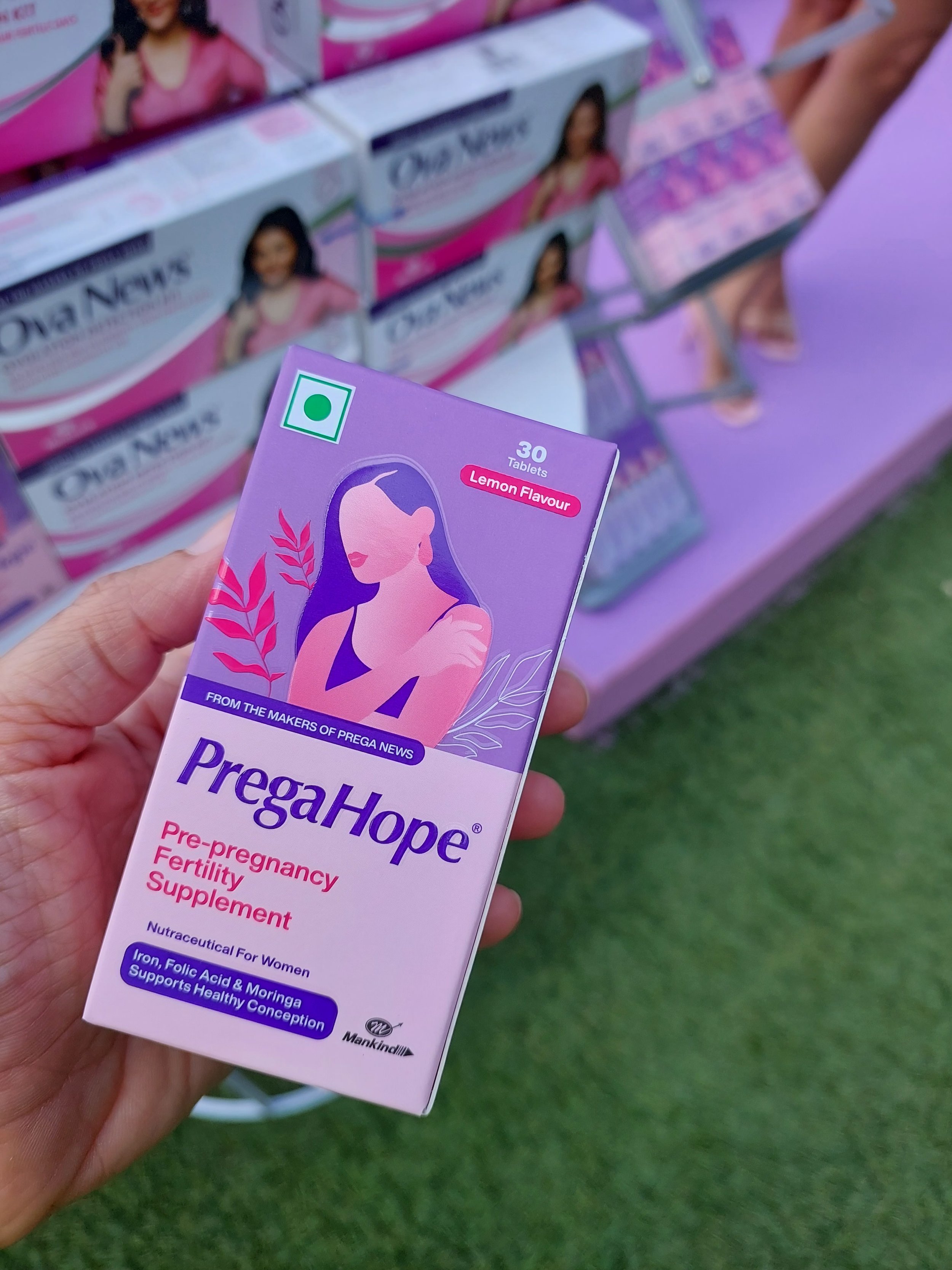
Coining the Brand Name: PregaHope
The decision to have a baby, is the beginning of one of life’s most beautiful phases. On the other side of this experience there will be another person. It’s why there’s that old saying a child gives birth to a mother. But before all this, there is the wait. And in there, lives hope, excitement, and the thrill of what’s to come. There are all these big dreams about little feet that will one day walk the earth.
There is that constant anticipation. It’s not without a reason that it’s called baby fever. Through all of life’s transformational bits we find our own support systems.
This moment of transformation should be no different. And through this sometimes uncertain, nerve-racking period, we hold a woman’s hand. We make sure her wait is easy with heady doses of optimism.
We make sure that what she remembers of this time is the abundance of hope that filled her heart
The Visual Mood: Intimacy, Gentle, Caring, Natural

The Packaging Design
The PregaHope packaging design embraces a modern and empathetic approach, reflecting the nurturing journey of conception. The visual design features a harmonious illustration of a mother in a protective embrace, symbolizing care and support. The packaging architecture is streamlined and functional, with a tall, cylindrical bottle for the lubricant that allows for ease of use and a compact, secure container for the supplements, ensuring product integrity and consumer convenience.
A soothing color palette of lavender and pink hues envelops the product range, imbued with the tranquility and warmth associated with maternal love. These colors also distinguish the products on shelves, speaking directly to the calmness and positivity expectant mothers desire. The typography is clean and contemporary, with a sans-serif font that ensures readability while exuding a soft and friendly demeanor. It strikes a balance between being clinically trustworthy and accessible, resonating with the product's promise of being a supportive companion through the fertility journey.

BUILDING THE PREGAHAPPY BRAND

The Packaging Design
The packaging design of PregaHappy exudes a sense of serene confidence, aligning perfectly with the brand's caregiver archetype. It employs a soft color palette of pastel lavender and gentle pink, which are traditionally associated with femininity and nurturing qualities. These colors are known to evoke calmness and comfort, mirroring the emotional support the brand promises to provide to expectant mothers.
The typography is elegant yet straightforward, utilizing a sans-serif font that contributes to the modern and clean aesthetic of the brand. The choice of a clear, legible typeface ensures that important product information is accessible.
Visual elements, such as the image of a content mother cradling her belly, resonate with the brand's narrative of joy, care, and support during pregnancy. The illustration style is contemporary and compassionate, with a warm and inclusive vibe that speaks directly to the shared experience of motherhood.
Overall, the packaging design for PregaHappy communicates the brand's positioning as a supportive companion through the use of colors, readable typography, and empathetic visual imagery, ensuring that it stands out on the shelf as a product that understands and celebrates the journey of motherhood.

The PregaHappy Brand Strategy
-
while the experience of motherhood is unique and full of surprises, the need for reassurance, comfort, and a supportive companion is universal among mothers-to-be. They seek a brand that understands the roller coaster of emotions and bodily changes they are going through and offers not just products, but emotional support and affirmation.
-
PregaHappy positions itself as more than a product; it is a companion and a confidante for the expectant mother, offering both comfort and reassurance. The brand promises to be there for the mother, not just to navigate the physical aspects of pregnancy but to celebrate the emotional journey with joy and optimism. The brand positions itself as an integral part of the mother's support system, ensuring that the memory of pregnancy is filled with joy and the feeling of being cared for and understood.
-
'The Caregiver.' This archetype is nurturing, compassionate, and protective, aiming to care for and provide support to others. PregaHappy embodies this archetype by promising to be the supportive friend that every expectant mother needs, ensuring they feel assured, loved, and comforted.
-
The brand voice of PregaHappy is nurturing, reassuring, and empathetic. It communicates like a close friend who is always there with a warm embrace and comforting words. It's a voice that says, "Don't worry. You’ve got this. We’ve got this,"—a voice that is as much about providing practical assistance as it is about emotional support. It's optimistic and joyful, emphasizing the positive aspects of motherhood and ensuring that the challenges are faced with a sense of confidence and communal support.